Fotopedia national parks app redesign
app UI + UX
Overview
Fotopedia national parks is an app lets you explore U.S. national parks easily on iPhone.
The goal of the redesign is to increase the traffic by refining the user interaction and keeping the rich database and useful features. During the process, I studied different user flow of different kinds of travelers, and I also explored how to iterate the system to fit novice, intermediate, and expert users.
My role
Entire product design from research to conception, visualization, and user testing
User Survey and Insights

Summary:
1. Young people get fewer preparations than older people.
2. They often go to the national park by their cars.
3. They usually go to the national park as a group.
4. Hiking and seeing nature is the most essential part of the journey.
5. Most of them are not so satisfied with the service.
6. The equipment providing service is not excellent.
7. The guide is somewhat crucial for first-time visitors.
8. People will do some preparations but not adequately preparations before the trip.
9. People like to go to the national park near their place.
10. People often go with their families.
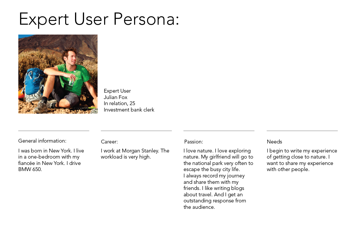
User Personas
I create 3 personas to represent the users: novice, intermediate, and expert user.


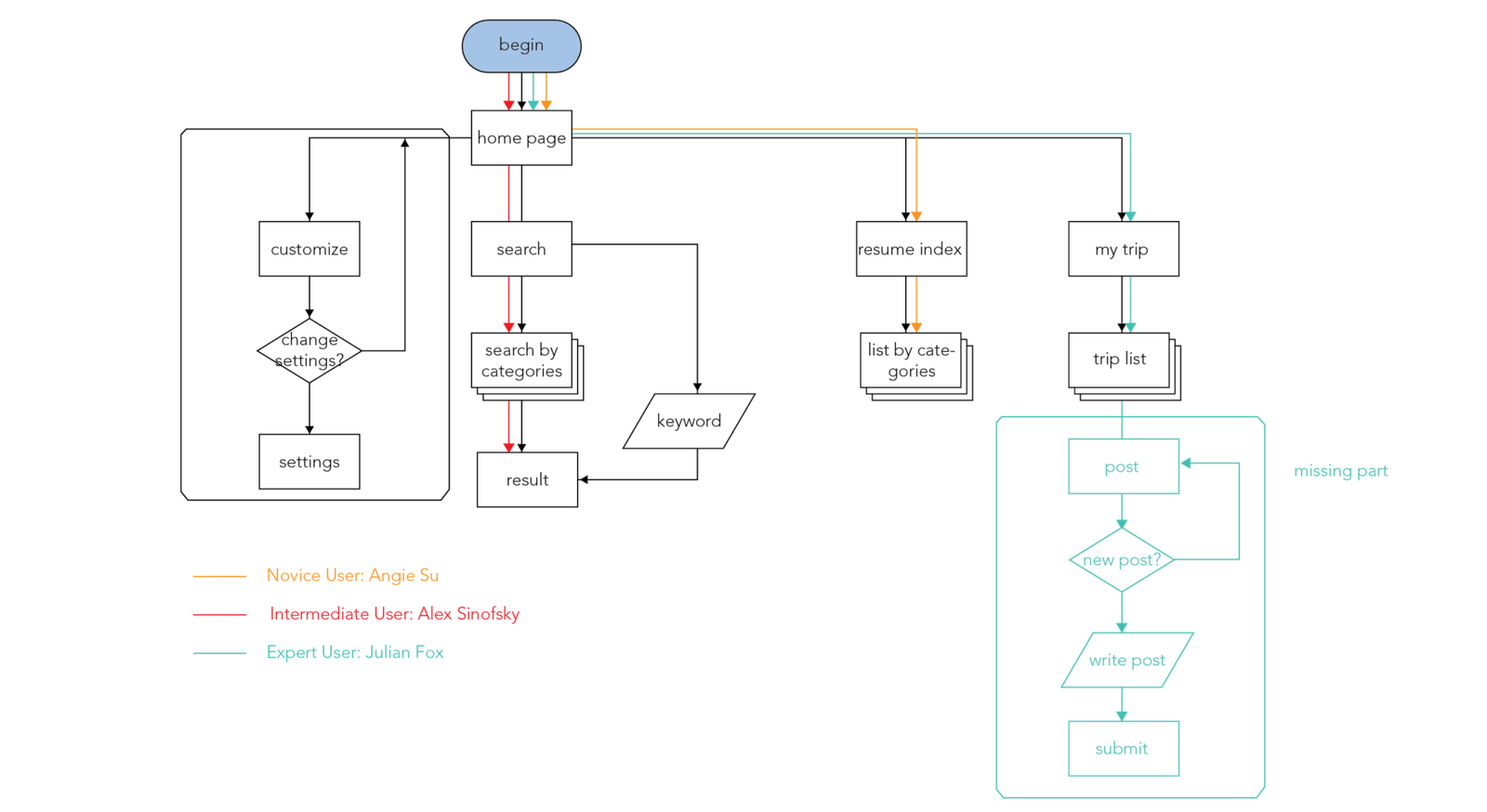
Information architecture and user flow
Based on the insights gained from the initial content audits, competitor analyzes, and user surveys, I define the sitemap and user flow.


Wireframe

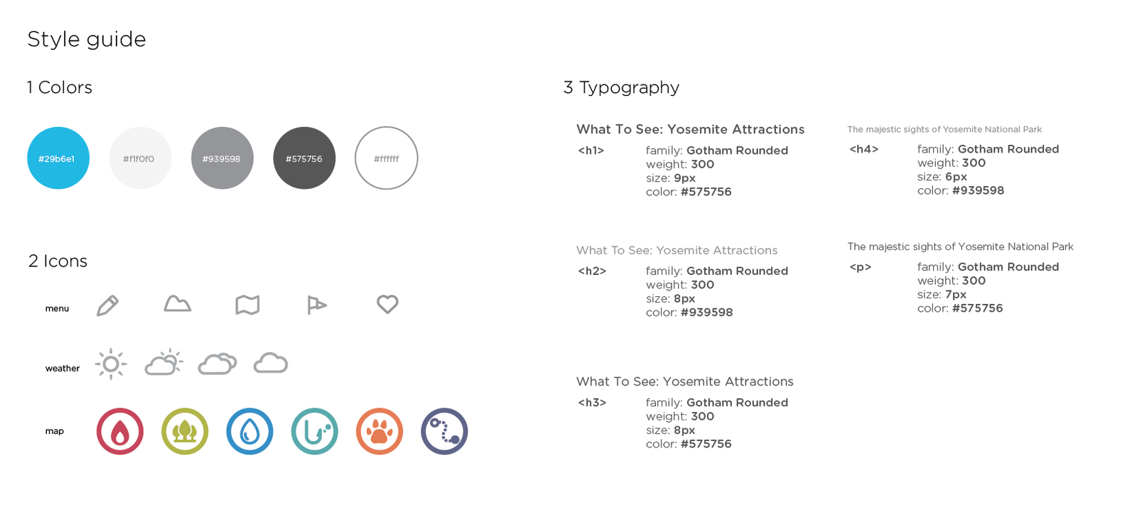
Visual design
To make the national park scenery prompt, I keep the UI lean and explicit.


