Google

Google

UX+UI+Design strategy

Due to confidentiality constraints, I can’t share most of the work at Google. I’m a UX designer on the Core UX team, currently leading design across two internal products simultaneously. My primary focus is MyTech – an app for managing and replacing assigned corporate technology, and Cloudtop – a virtual machine platform that supports day-to-day workflows. Here are the highlights of my work:

MyTech

I’m leading design efforts to transform how Googlers manage their corporate technology. My work is focused on:

Unifying fragmented experiences across support, acquisition, and tech management into a single, cohesive hub with 28K daily active users.

Redesigning the tech acquisition flow, shifting away from a traditional shopping model to a more intuitive, guided flow tailored to user demand under corporate policies. Helped reduce tech acquisition and support costs by 20%. Achieved a CSAT score of 85%.

Successfully integrating AI in three stages, starting with inline AI answers, then expanding to contextual recommendations, and finally launching a proactive support AI agent embedded within the experience. Support ticket volume dropped by 40% after implementation

Cloudtop

I’m leading the design of Google’s virtual computer platform used by the vast majority of developers. My work is focused on:

Designing the end-to-end Cloudtop Management Portal,  complementing the command-line workflows with a visual UI.

Streamlining VM creation by replacing a dense, expert-only form with a three-step guided flow, resulting in a 62% reduction in time-to-create.

Material Design 3

As a 20 % project at Google, I partnered with the Core Design System team to extend the Material Design 3 library:

Building the Toolbar component, audited existing use cases, designed variants, authored guidance (use cases, anatomy, guidelines), and produced the spec sheet.
Designing an interactive Figma presentation that educates teammates on using the GM3 library, all motion and interaction created entirely in Figma.

Collov Home Design

Collov Home Design

B2C Web

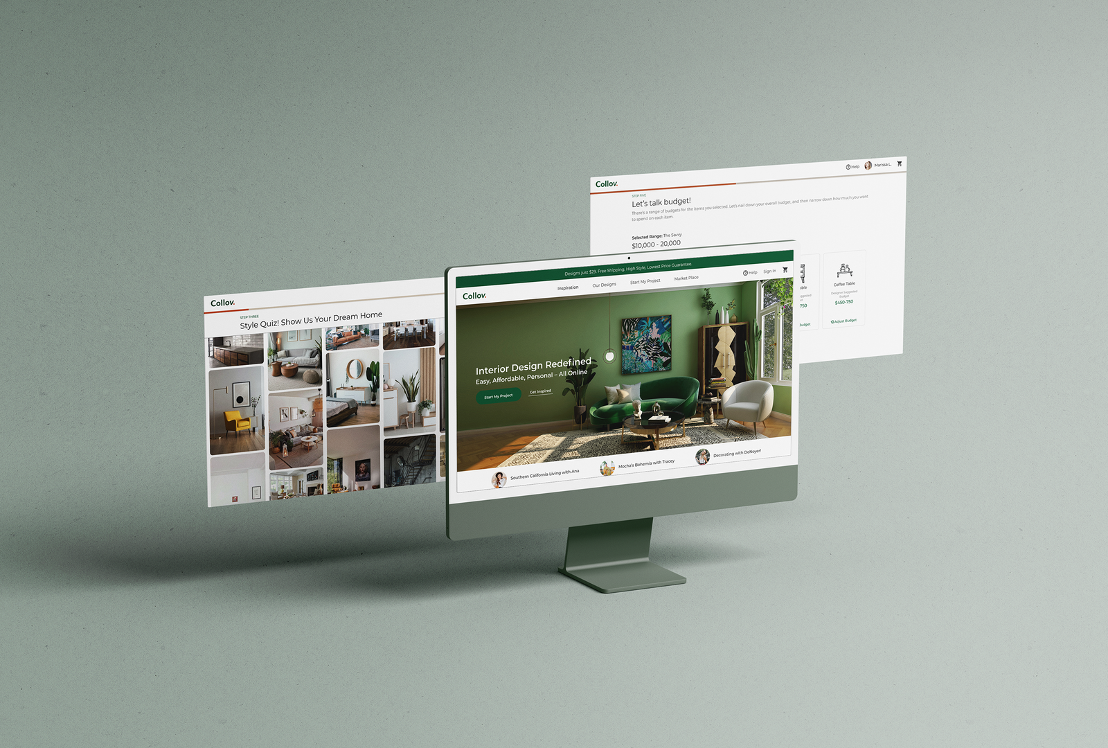
Collov Home Design is a B2C online interior design platform that simplifies and personalizes the home décor process by offering affordable 3D design services and curated furniture recommendations—all in one seamless experience.

As the Lead UX/UI Designer managing a team of three, I led the end-to-end design of the product while driving cross-functional collaboration with engineering, marketing, interior design, and sourcing teams across the U.S..

MY ROLE

Lead UX/UI designer

TIMELINE

Apr.2020 — Aug.2020

TOOLS

Figma, Photoshop, Illustrator, Principle, and After Effects.

OUTCOME

Fully shipped end-to-end design of web experience

Understanding Collov’s Business Model

Collov provides affordable interior design services, generating revenue through the sale of furniture featured in each design proposal.
The web platform allows users to browse inspiration photos, take a style quiz, submit design requests, and manage ongoing projects. Complementing this, the AR app helps users accurately measure their rooms and create detailed floor plans.
On the backend, a dedicated portal enables interior designers to efficiently manage and deliver user projects.

Pain Points

Customer Pain Points

·  Providing requirements is time‑consuming
·  Projects move too slowly

Interior Designer Pain Points

·  Too many revisions
·  Inefficient communication via email

The Design Goal

How might we create a more efficient and guided workflow that reduces back-and-forth communication, shortens project timelines, and improves clarity between customers and interior designers?

The Results

DISCOVERY
User Research

The design team analyzed 50 user cases to uncover pain points in the Collov service experience. I also spent two weeks shadowing the interior design team to understand their workflow and challenges.

An example of a customer’s pre-design email
I reviewed customer emails, highlighting and summarizing key requirements shared before the design phase.

A typical response email from an interior designer
Interior designers manually copied and pasted furniture links from external websites into emails for customers to review and choose from.

DISCOVERY
Key Findings

The email content can be categorized into three main types:

Overall style requirement

Requirements of a specific item

Provide more room information

DEFINE
User Flow

Based on the findings, I started to revise the user flow.

DEFINE
Block Wireframe

Based on user flow, I sketched the block wireframes. I listed all the features on each page and got early development estimation from the developer team.

DESIGN

Generic onboarding questionnaires slowed communication between designers and customers

Through user interviews, competitive analysis, and discussions with our interior design team, I found that simple, generic questionnaires (e.g., “Which room do you want to design?” or “What’s your preferred style?”) often failed to capture customers’ actual needs. This led to unsatisfying design proposals or required lengthy follow‑up exchanges to clarify details.

To solve this, we gathered more specific information upfront and tailored the questionnaire by room type. For example, a kid’s room required a very different set of details than a master bedroom, enabling us to better understand and address each space’s unique needs.

DESIGN

Object detection helps designers uncover customer intent in inspiration photos

During user interviews, many participants expressed interest in specific items within inspiration photos but didn’t know how to identify or source them.
To solve this, I proposed using object detection to identify furniture pieces directly within the images. This helped designers better understand customer preferences and select suitable items for each design proposal. I also created a prototype in Principle to help developers visualize the intended user experience.

DESIGN

Getting accurate needs from customers.

Budget breakdown — In addition to setting an overall budget, customers often have individual budgets for each major furniture item.
To support this, we collaborated with the interior design team to define the essential pieces for each room type and established default budget ranges for each item under various pricing tiers.

DESIGN

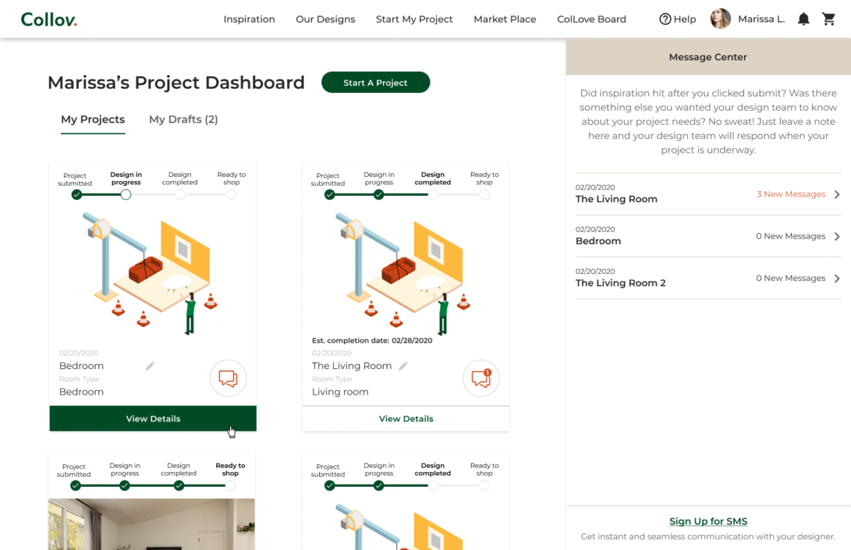
Project Dashboard 

Project Dashboard

DESIGN

Design System

I built the design system from scratch and maintained the Figma component library.

DESIGN

Branding

Thoughts and Takeaways

Working at a fast-paced startup was both fun and rewarding, especially seeing how we transformed the interior design process. I took on responsibilities beyond design—covering much of a PM’s role and supporting customer service as well. It was a rare opportunity to gain a holistic view of a large-scale project while collaborating with people from diverse backgrounds—a truly irreplaceable experience.

Collov AR

Collov AR

UX+UI

Collov AR app is part of the Collov Home Design service. It provides an effortless way for customers to submit their floor plans and review the final design proposals.

MY ROLE

– Lead UX/UI designer

TOOLS

Figma, Photoshop, Illustrator, Principle, After Effects, HTML, CSS, and Javascript.

TIMELINE

May.2020 — Aug.2020

Challenge

Provide an easy way for users to measure their rooms and view the final design proposals.

DISCOVERY

User Research

The design team collected 50 user cases to uncover the pain points while using the Collov service.

DISCOVERY

Pain Points

DEFINE
User Flow

Based on the findings, I started to create the user flow that covers four scenarios:

1. First-time user

2. Add floorplan

3. View virtual design proposals

4. Approve design

DESIGN

Decision making — Recognize the floor

DESIGN

Decision making — From “Set dot base” to “Aim at a corner”

DESIGN

Decision making — Height first or base first

DESIGN

Visual Design

Instead of the usual “Start” button, I decided to combine the authorization process with the start action.

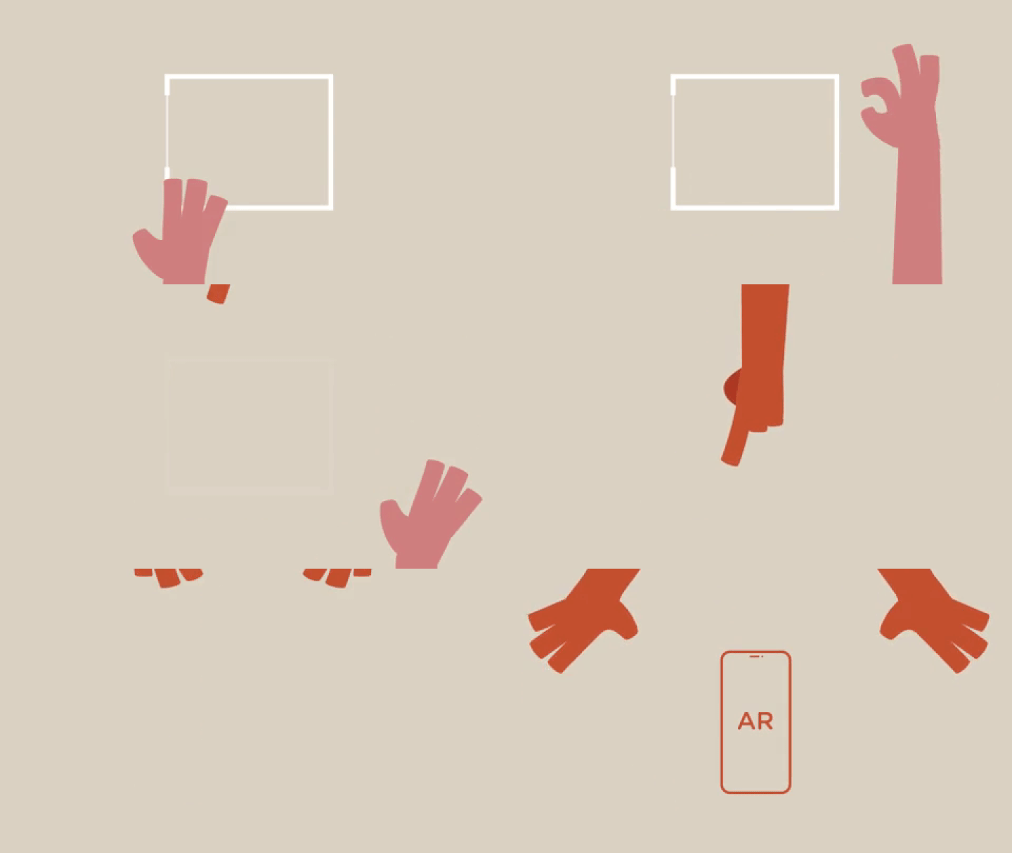
Find the floor: Simple animation to show the user how to move the phone.

Measure the floor plan and the room height.

Shopping Mode and approve design: Collov sells furniture for profit. Providing a direct and easy shopping experience is a crucial part of our design. Clients can also approve or disapprove of the furniture piece.

Outcome

Collov Backend For Interior Designers

Collov Backend For Interior Designers

UX+UI

Collov Backend tool provides a platform for our in-house interior designers to manage and design the cases.

My role

– Managed a UX/UI design team of three
– Collaborate closely with the developer team, interior design team, and sourcing team.
– Developed the design system and maintained the Figma component library.
– User research, User experience design, User Interface design

Tools

Figma, Photoshop, Illustrator, Principle, and After Effects.

01. UX Research

The whole team spent a month observing how our interior designers work and collaborate with buyers and interior designers in China.

There are four crucial goals to make our interior designers’ life easier.

  1. Better case management system.
  2. Better layout of customers’ information.
  3. Better interior design tools.
  4. Make collaboration with other team members easier.

02. User Flow

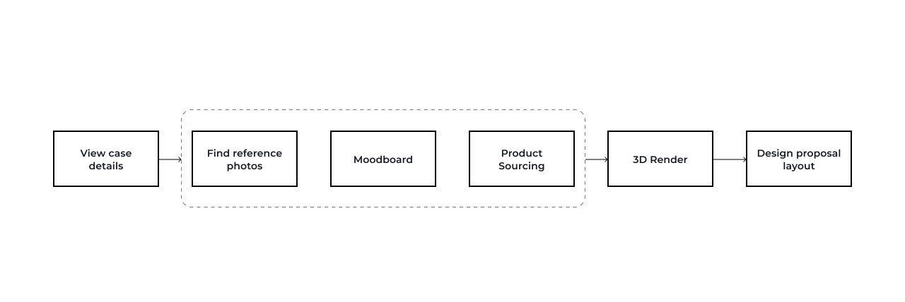
After rounds of observation and discussion with the interior design team and sourcing team, this is the draft version of the ideal flow of completing a case:

It needs 6 steps to finish a case. After reviewing the information submitted by the customer, the interior designers will go through the rest of the steps. Find reference photos, design mood boards, and product sourcing usually happen simultaneously.

Presenting customers’ information properly will save tons of interior designers’ time.

The interior designers were using Google drive to manage the design cases. They got screenshots of the clients’ information from the engineering team. Design managers will go to each case folder and approve the design.
It’s inefficient and hard to get the whole picture of all the cases.

New Design:
The top bar list the basic information about the case, including client name, case status, assigned designers. The second navigation bar helps the designers work on different steps simultaneously. The main working area which is the customer info section in this case is customized. Interior designers can change the position of the modules to fit his/hers preferences.

Finding reference photos relies heavily on our AI technology.

The AI will help interior designers analyze customer notes and auto-generate some keywords as tags to filter the reference photo library. Interior designers can also highlight some of the notes for future reference. The single and multiple photo analyses will list the top results such as styles, materials, and colors so that interior designers can better apply those results to the library. I put all the analysis tools on the left and leave the main working area to the reference library.

The Mood board tool provides a quicker way for interior designers to present the early concept to the customers.

The mood board tool combined the design tool and the sourcing tool. Every piece of furniture is in our inventory system. The designers can easily make the moldboard and finish the draft sourcing list at the same time.  

The new emoving background tool is essential for our early-stage business. Our designers used to use Photoshop or Canva to deal with thousands of furniture pictures with backgrounds. It cost too much time. The developer and I work together on the adaption of Canva background remover API to our backend.

Improving the communication between interior designers and the sourcing team will make their lives much easier.

Designers often collaborated with other team members and get suggestions from the sourcing team. Adding a communication function inside the mood board design area will help them get feedback immediately and keep track of the suggestions from the senior designers. 

03. Visual Design

Design System:

I built the design system from scratch and maintained the Figma component library.

04. Outcome

Discover local insights App

Discover local insights

UX+UI

Overview

Discover local insights is a web app that empowers customers in exploring commercial behavioral trends around the neighborhood. I’m the UX and UI designer in the team, along with a developer.

Click here to see the live App.

My role

UX, UI

Our process

This is our process with campaign manager, product manager, design team and development team.

Part of the process are confidential.

Requirement

My task is to design a business-oriented app combined with Tapestry Segmentation. Rather than dropping people into a map with a query field for a ZIP Code, the app should step users through an intuitive wizard that results in a map.

At the kick off meeting, I summarize the following requirements:

– Map Based
– Business-oriented
– Tapestry Segment
– Zip code
– Add in a sample of interesting data variables
– Share results

Goal

As a result, users will get higher response rates, avoid less profitable areas, and invest their resources more wisely.

Showcase how Esri’s vast business and demographic data can provide even greater insight when combined with data that businesses already hold.

Users will reach out the product team for more information.

Existing Resources

ArcGIS Tapestry Segmentation is a solution to understand customers’ lifestyle choices, what they buy, and how they spend their free time. It gives users insights to help them identify their best customers, optimal sites, and underserved markets.

There are 67 Tapestry Segmentation to describe American’s neighborhood life mode. It includes demographic data, consumer spending data, and lifestyle/behavioral trends.

Research

Card sort by business owners and marketing managers shows the priorities of the business data sets. This acts as the blueprint of the app structure.

After I get the priority of the business data categories, I pick the top data sets from each catergories.

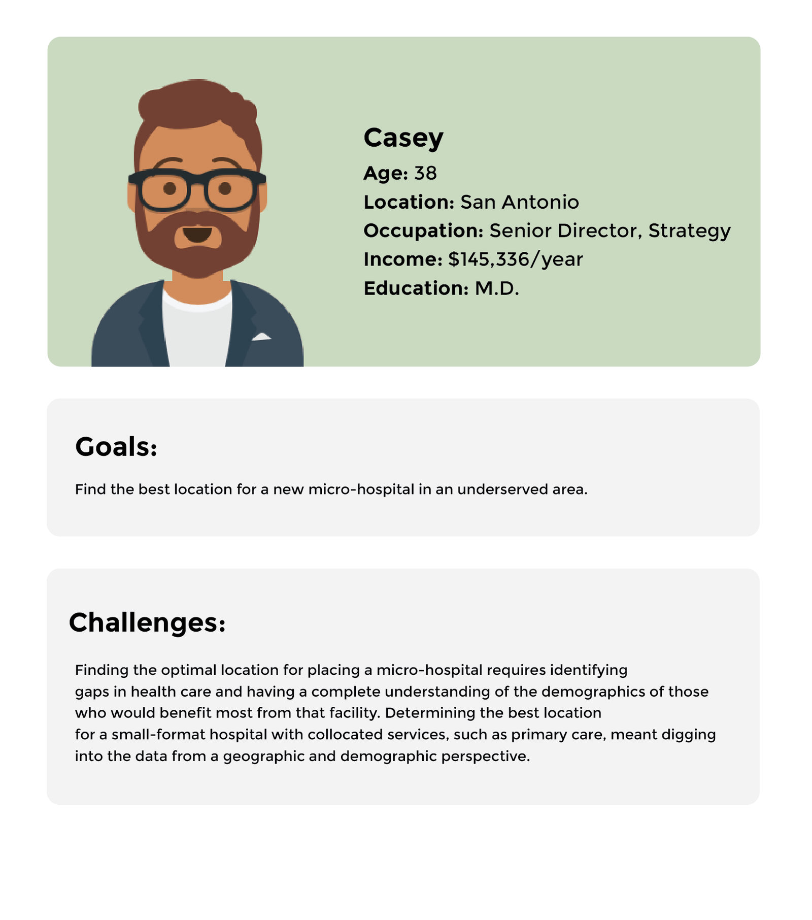
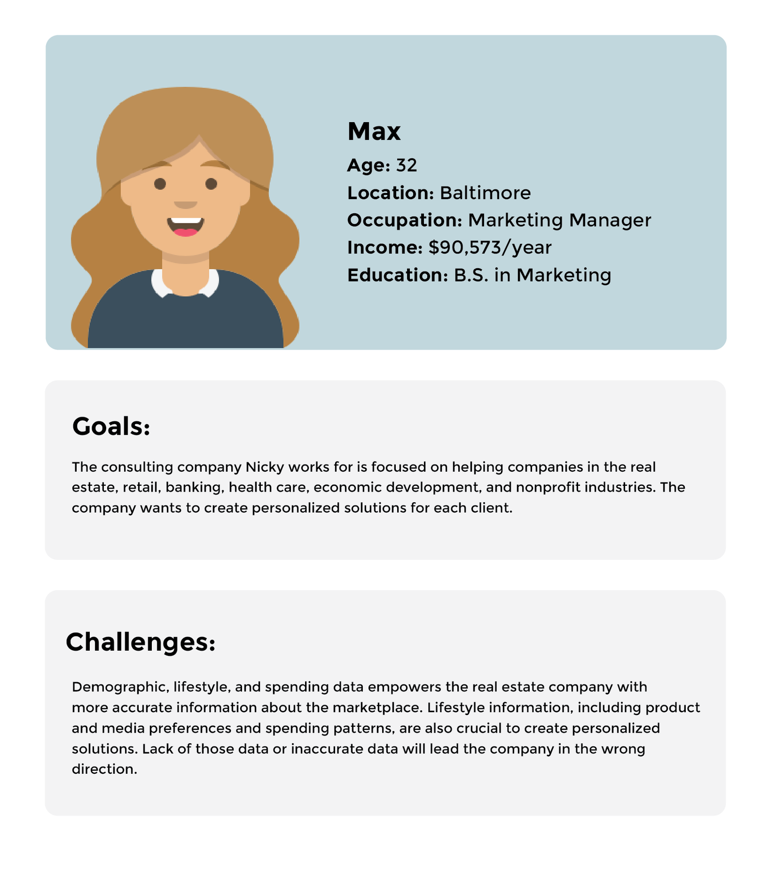
Persona

Splash screen & enter zip

Splash screen briefly explains what users are about to experience. Then enter zip code and choose two data categories to initiate the app.

Main screen

The central part of the app is based on maps. The map is divided into colorful zip code area, each color represents the top Tapestry Segments of this zip code area. Hover the zip code area will show users the Tapestry name. By clicking the area, users will get 4 sets of visualized data. The top three Tapestry Segments and Median Income are default data. The other two are the ones user choose in the previous step. Each data will expand and show details on click. There are also two analysis tools: Drive Time and Ring Buffer function at the top right corner to help users find out how geoinformation will affect this area.

After 3 tryouts, the app will gate the user and ask for contact info.

Elevation

Super Approach

Super Approach

UX+UI

Overview

Super Approach is an app providing a quicker and cleaner way for citizens to report issues around them and evaluate others’ reports.

During the two-days Hackathon, we used existing ESRI technology to design and develop an app for citizens and won the overall winner prize.

Click here to see the demo app.

My role

Product Strategy, Interaction, Visual design, Developing

Painpoint

Survey 123 for ArcGIS is an existing ESRI product. One feature function is to collect data via web or mobile devices through users. Cities often use this product to monitor infrastructure issues. The Quick Report function will allow citizens to report issues such as broken traffic lights.

But according to the feedback from the users, they forget about the issue they want to report after leaving that location easily, and filing a report usually can be hard and frustrated.

Existing Techniques


Survey 123 for ArcGIS, ArcGIS Hub, Quick Report, Citizen Problem Reporter, Redlands City Report

Concept

Our process

This is our process with the other two GIS professionals and two developers.

Designs

With the clock ticking, I quickly did some mockups of the basic user journey. I opted for a vintage color palette since the Relands oldtown has a long history. I also created a symbol according to Redlands city animal – owl.

Demo

It took us half a day plus one night to develop the full functional Super Approach app. We plugged in data from Quick Report and Hub, added government polls and proposals to nearby items. I did some of the HTML and CSS.

Click here to see the demo app.

Results and takeaways

We won the overall winner in ESRI Hackathon 2018.

Podbot Factory

Podbot Factory

Onsite interaction

Overview

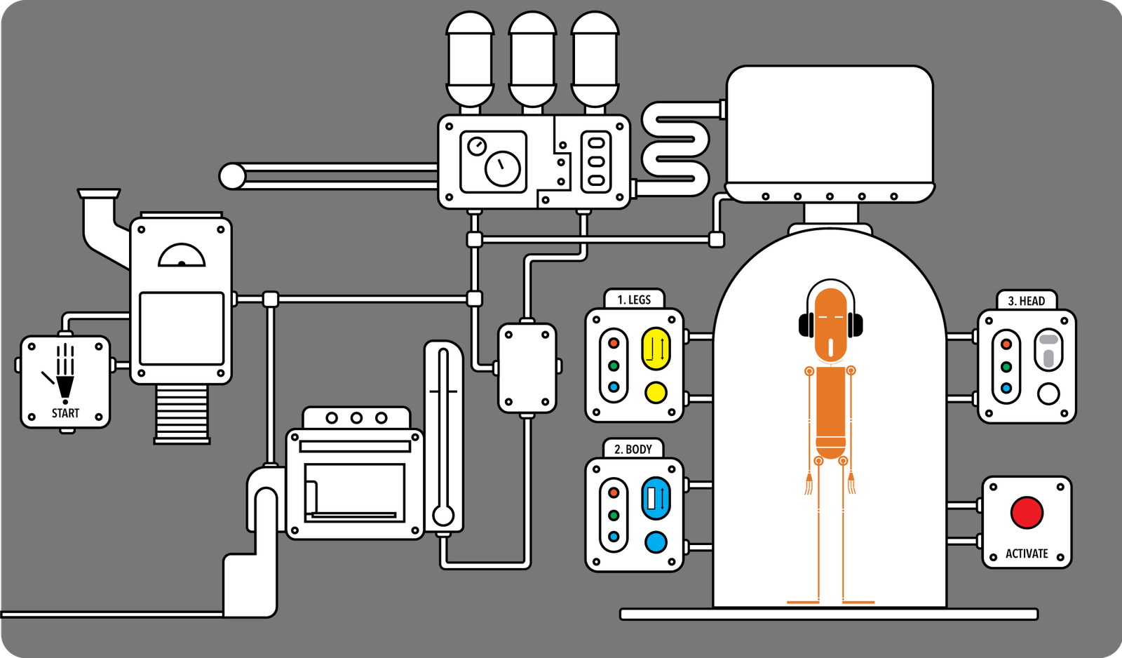
Podbot Factory is an onsite interaction project that developed the relationship between toys and people with an analog deliverable. During the playing, I observed how people connect tangible components with digital output, I also explored the opportunities of future toy-human interaction through Podbot characters.

My role

Product Strategy, Interaction, Visual design, Developing

Demo

Inspiration

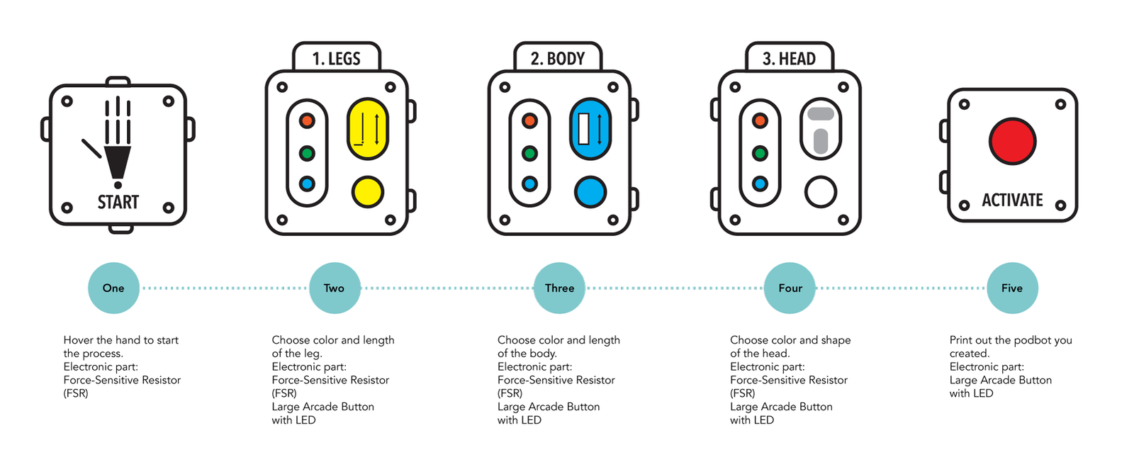
Podbot is a toy brand I designed before. After I learned Processing and Arduino, I decided to turn the flat image into an onsite interaction project.

User flow

Technique details

Image result for arduino LOGO"Image result for PROCESSING LOGO"     Image result for ADAFRUIT LOGO"

I created the visual in processing and tangible control in Arduino. The buttons are bought from adafruit.

Results and takeaways

On the presentation day, more than 200 podbots were created by visitors.

Peal – A solution for diabetes

PEAL

UX + UI + Product

Overview

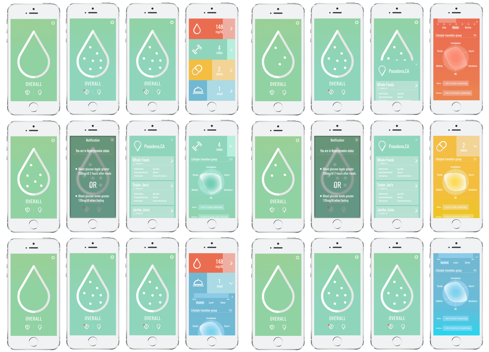
Peal aims to create a healthy lifestyle transition for a patient who has recently been diagnosed with diabetes.

During the project, I observed how social impact influence the human’s daily behavior, and also I explored how ecosystem integrates the product into people’s everyday life.

My Role

Product Strategy, User Research, Prototyping & Testing, Visual design

Press: 

Challenge

Diabetic patients have a tough time adjusting to their new lifestyle; keeping track of pills, blood tests, deciding what to eat, logging what they ate, tracking their fitness, and staying up to date with all this is a challenge. Also, having a robust emotional support system to give advice and guidance is crucial during this transition.


Opportunity

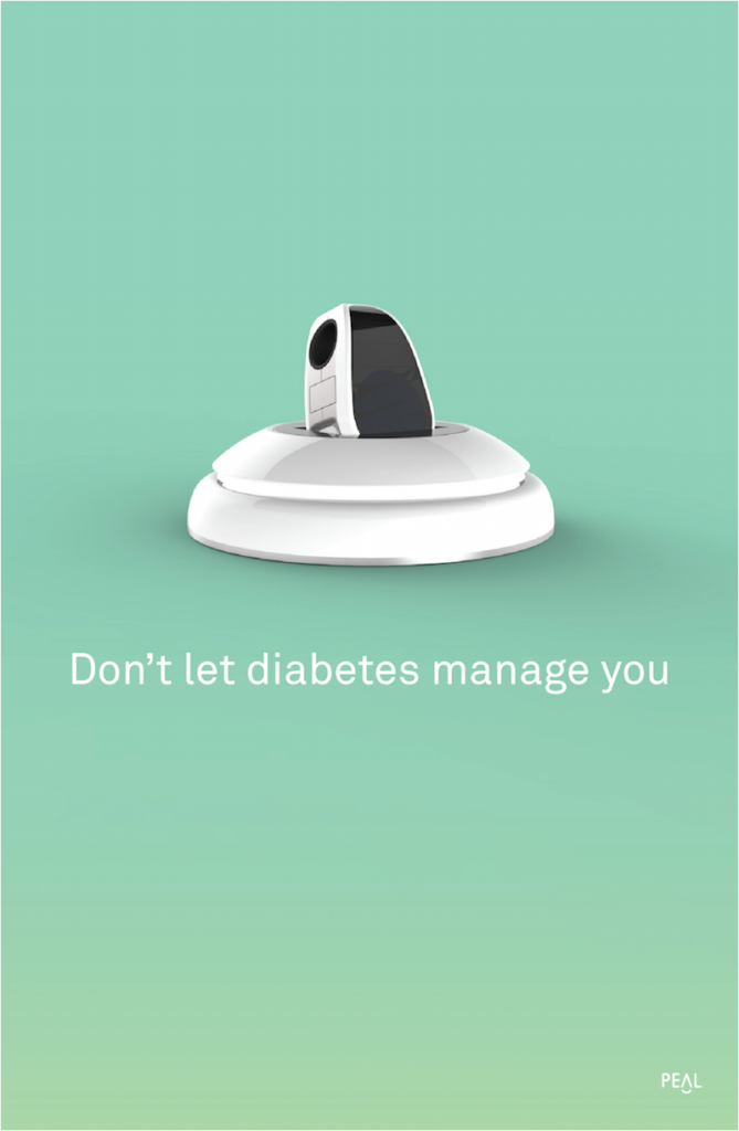
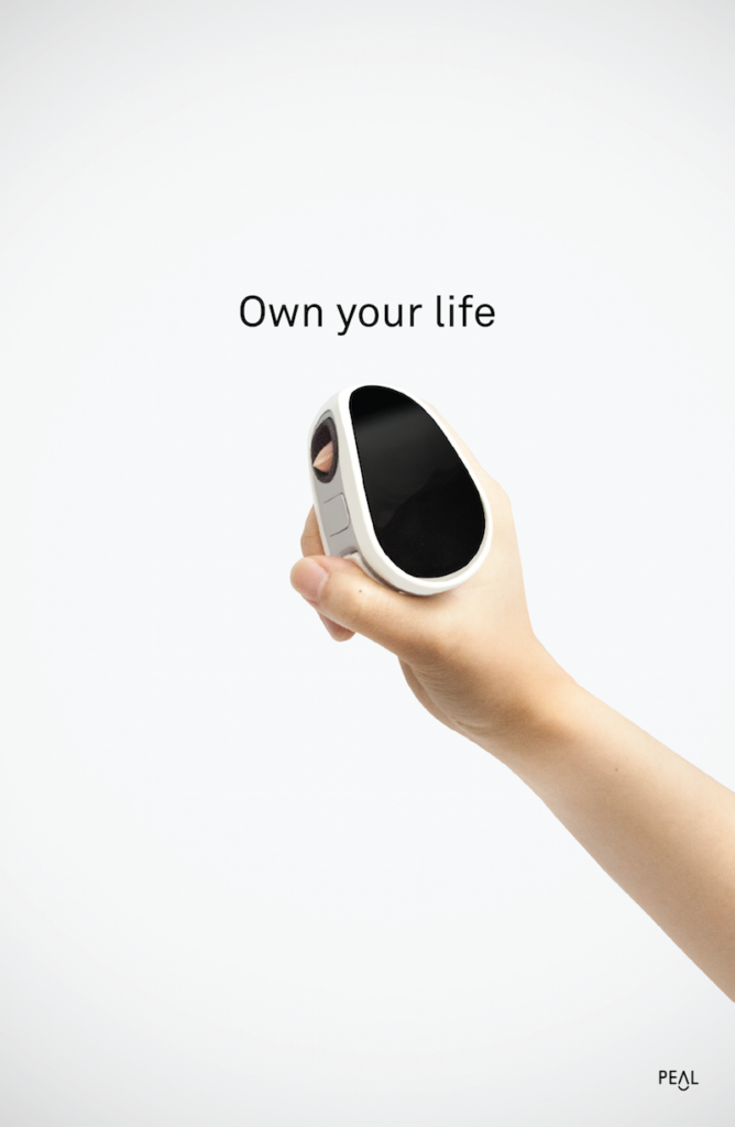
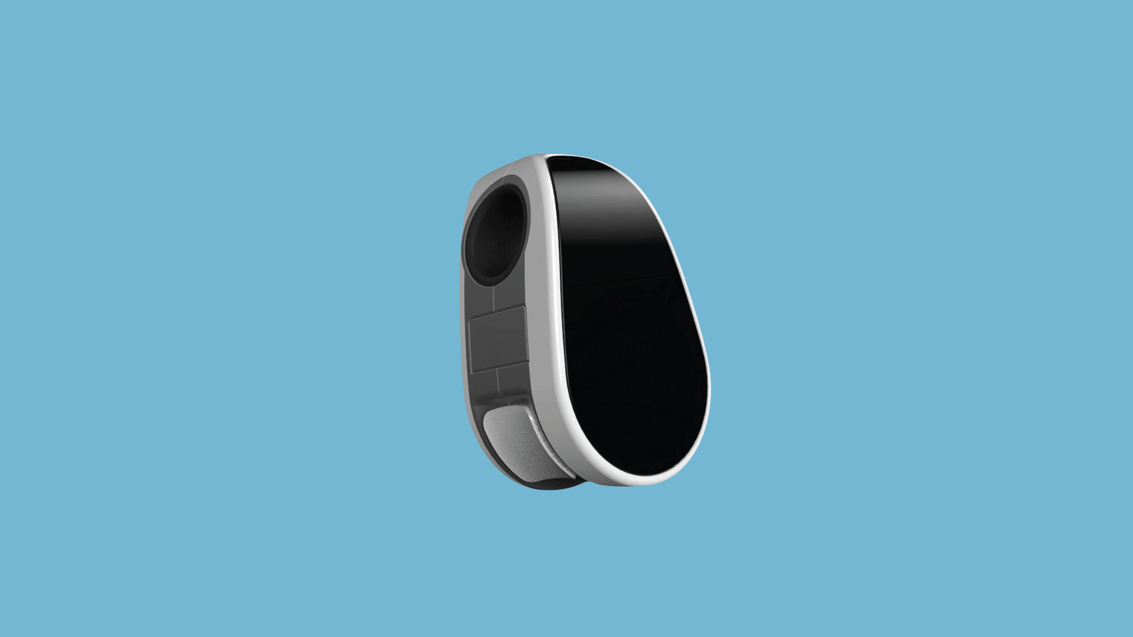
The Peal system aims to create a healthy lifestyle transition for a patient who has recently been diagnosed with diabetes. We use a technology called occlusion spectroscopy, which allows us to make our glucose monitor non-invasive. To take a test, simply place your finger in the device and wait for a few seconds. All the data goes to our application.

System diagram

There are three parts of Peal system:
Outdoors:
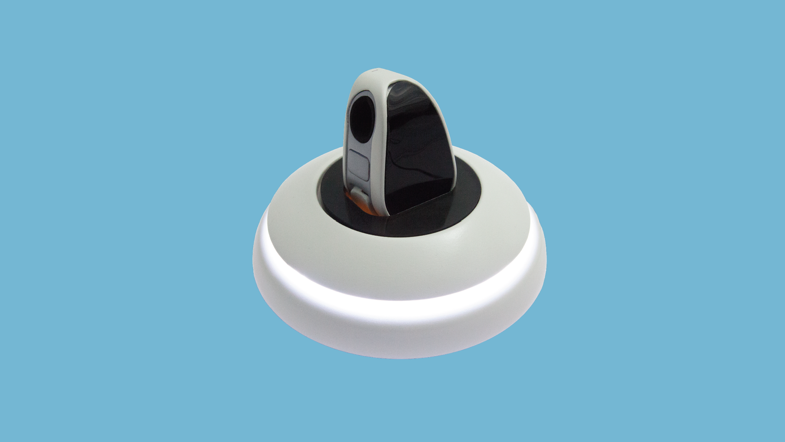
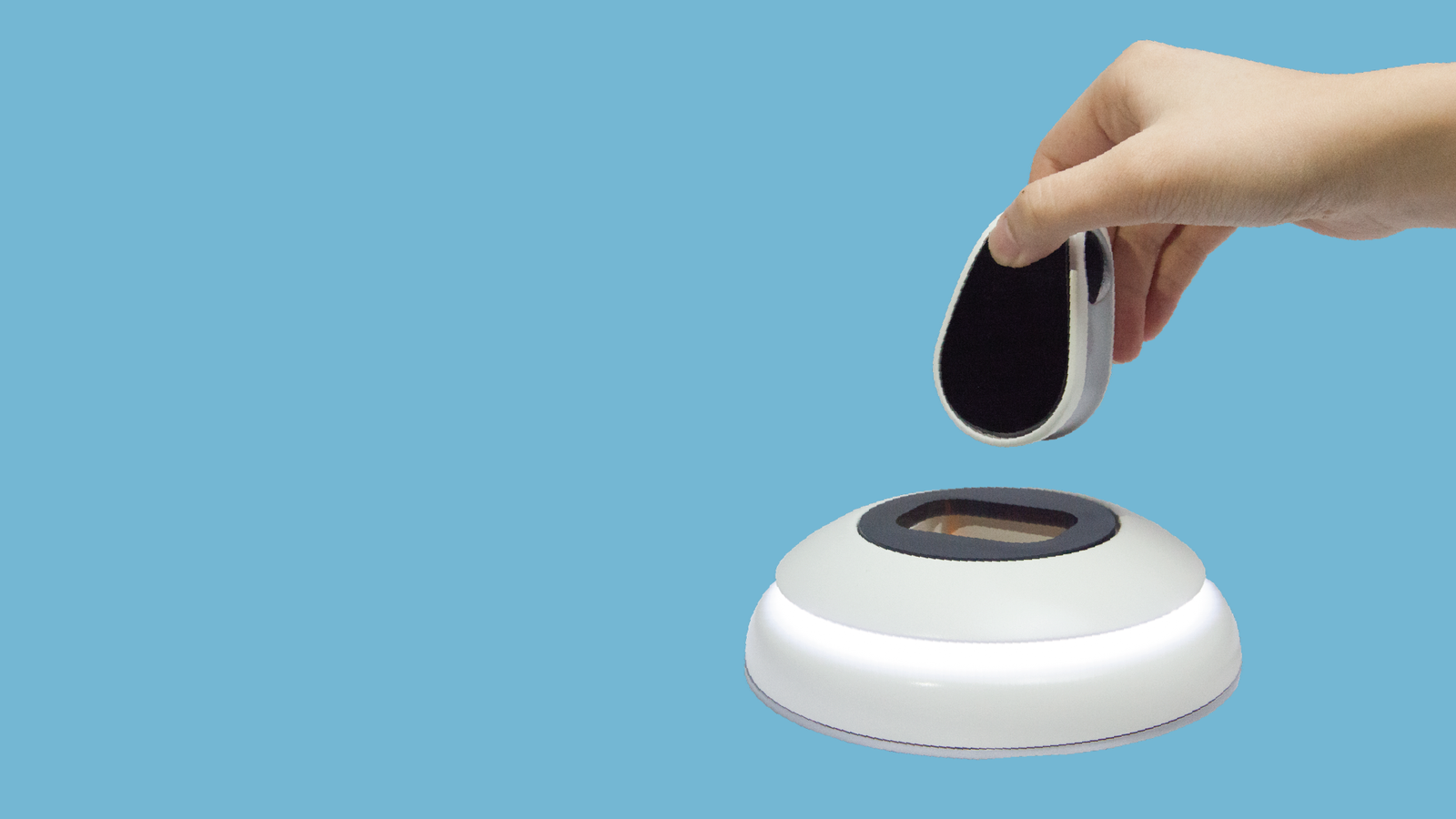
The pocket-size noninvasive glucose tracking device can let the patient take the glucose test anywhere anytime.
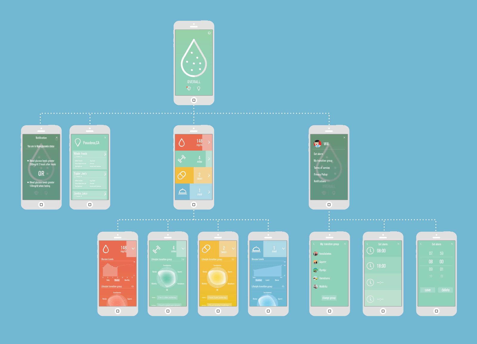
The mobile application will record and display glucose, exercise, and medication condition, show community updates, and also a reminder.
Home:
The home device is a charging device for the tracking device, it also shows how the patient did through breathing light.
Data management:
Dell Cloud Database will collect patients data, accumulate patient information for future references. The doctor will give patients precise advice through abundant, accurate information.

App interface

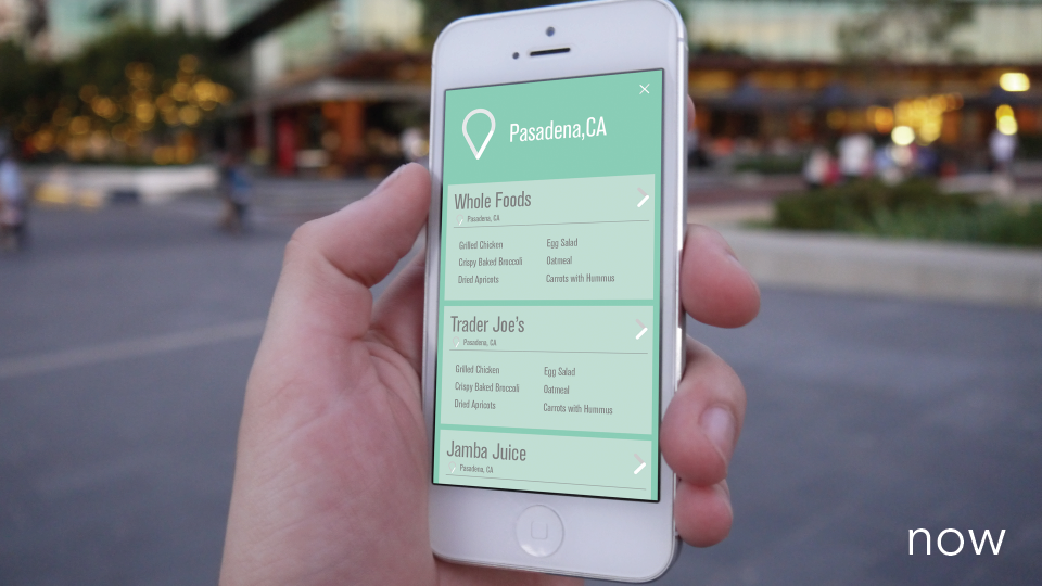
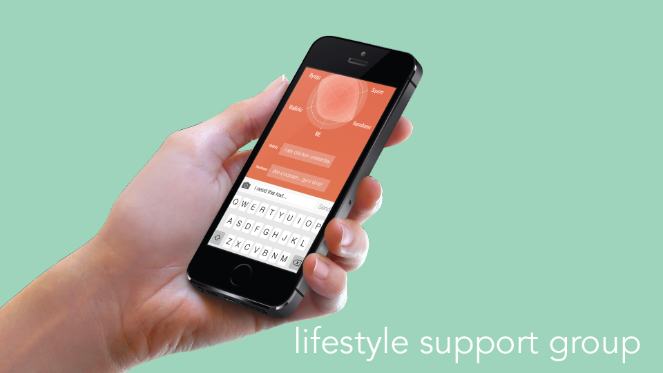
Through our app, you can keep track of your pills, fitness, diet, and glucose levels giving you a comprehensive picture of your health. Unlike other fitness trackers, we make meaning of your data and notify you when there is something you need to know. Also, we have two key features we call NOW and LIFESTYLE.

NOW is a food recommendation services base on the user’s location. It is hard for diabetes patients to find the right meal while eating in a restaurant. NOW will recommend food for patients from the restaurant that is diabetes-friendly.

LIFESTYLE is a group of people that have the same condition as the user. They have the same doctor. The group will share their process, ask questions, and encourage each other.

Userflow

Product details

We use SolidWorks to build the 3D model and render it in Keyshot. Then we use 3D print and polish the mockup product with primer, acrylic, and spray paint.

Fotopedia national parks app redesign

Fotopedia national parks app redesign

app UI + UX

Overview

Fotopedia national parks is an app lets you explore U.S. national parks easily on iPhone.

The goal of the redesign is to increase the traffic by refining the user interaction and keeping the rich database and useful features. During the process, I studied different user flow of different kinds of travelers, and I also explored how to iterate the system to fit novice, intermediate, and expert users.

My role

Entire product design from research to conception, visualization, and user testing

User Survey and Insights

Summary:
1. Young people get fewer preparations than older people.
2. They often go to the national park by their cars.
3. They usually go to the national park as a group.
4. Hiking and seeing nature is the most essential part of the journey.
5. Most of them are not so satisfied with the service.
6. The equipment providing service is not excellent.
7. The guide is somewhat crucial for first-time visitors.
8. People will do some preparations but not adequately preparations before the trip.
9. People like to go to the national park near their place.
10. People often go with their families.

User Personas

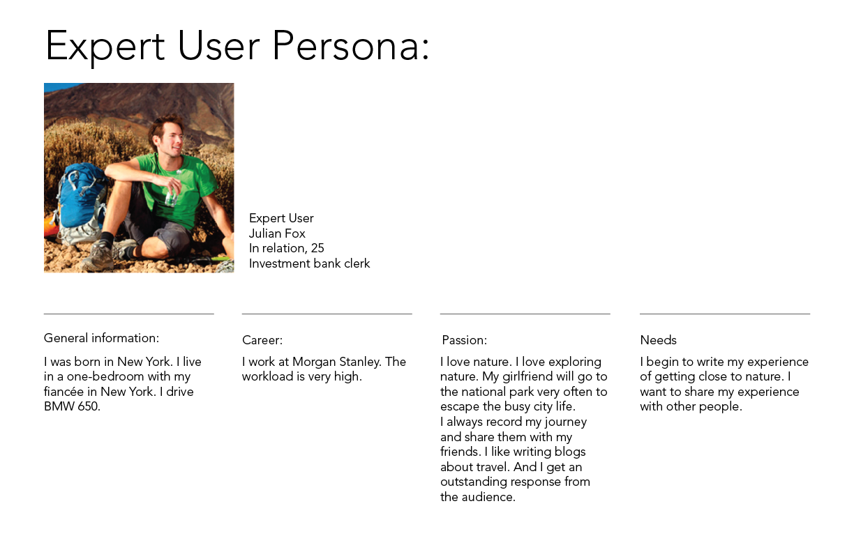
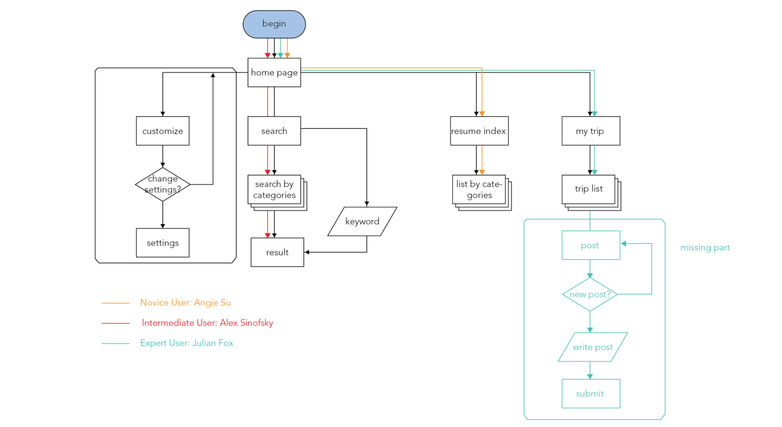
I create 3 personas to represent the users: novice, intermediate, and expert user.

Information architecture and user flow

Based on the insights gained from the initial content audits, competitor analyzes, and user surveys, I define the sitemap and user flow.

Wireframe

Visual design

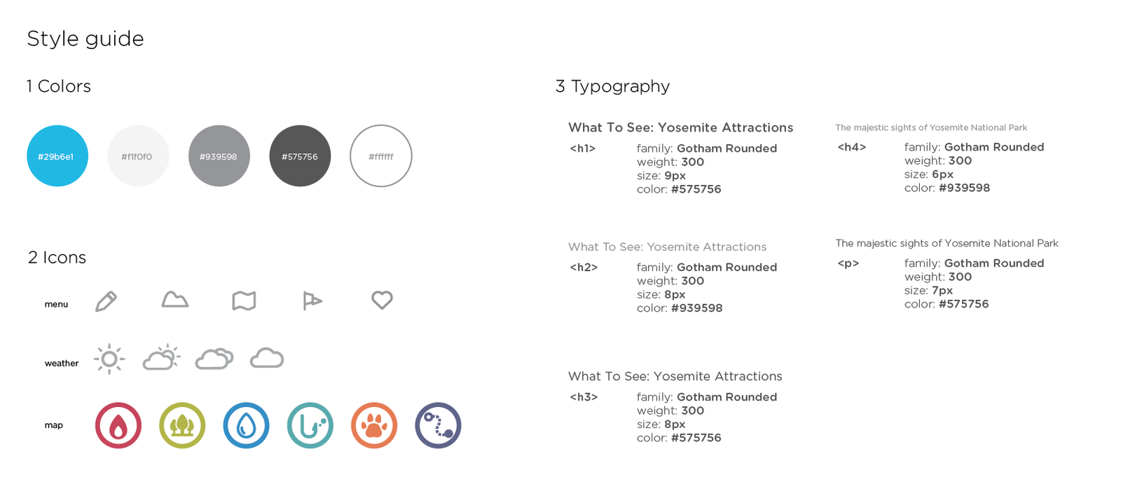
To make the national park scenery prompt, I keep the UI lean and explicit.

Expressive button behaviors

Expressive Button Behaviors

UX+Web

Buttons are everyday elements of interaction design. There are certain rules to make the best practice for buttons in creating a smooth UX flow in web and apps. 

What if the button has personalities? My expressive button behavior experiment explores the possibilities of how buttons express emotions through simple interaction. 

I use HTML, CSS, and Javascript to create 8 button behaviors.

The souce code is available here: https://github.com/claudiawang38/expressive-button

1. Timid
The timid button will avoid the cursor once on hover.

2. Needy
The needy button will follow the cursor once the cursor gets close to it.

3. Itchy
The itchy button will wiggle when on click.

4. Stubborn
The stubborn button will do nothing.

5. Scared
The scared button will wiggle on hover and run away on click. The wiggle range is smaller than the itchy button.

6. Cold
The cold button will wiggle, shrink and turn blue on click.

7. Hot
The hot button will be bigger, move down a little, and turn red on click.

hot

8. Lazy
The Lazy button will act slower than a regular button on click.

Ideation

I list several potential emotions and human behaviors that can be expressed by web language. Then sketch out each button behavior. During the sketching, I noticed some interesting details: The jitter of the scared button is subtly different from the itchy button, people will shake more when being tickled, so I put larger numbers in the itchy button animation translate attributes. Also, people will shake when the tickle action is being performed, so I use jitter on click in the itchy button and jitter on hover in the scared button.

There are so many details to notice when I try to mimic the emotion precisely. Many of them can be presented by combining 4 simple attributes: position, scale, color, and interval.

The whole experiment gives me a deep understanding of how to improve button-human interaction. By slightly changing/combing simple attributes, the button will express totally different meanings.